Halla! The last three weeks has been focused around WordPress, editing themes and making a WordPress from scratch. First two activities were quite small, on the side I’ve been working on a mandatory assignment, last week was longer and became a little delayed.
Part 1 – Installing WordPress.
First things first: install WordPress. I installed WordPress to my hosting site. Surprisingly easy after it was done, but the process was frustrating and felt like some real hacker process. One way is to install it locally; on your computer, I tried for hours but it didn’t work. So I went for te less complicated method.
Part 2 – Choose a WordPress theme and cutomize it.
WordPress comes with A LOT of premade themes, quite handy! Though I do not find them as customizable as I wish they could be. Each theme was different limits, pros and cons. Most likely I’ve watched too many ads for Webflow and expect web editors to be as adaptable and flowy.
Part 3 – Make a WordPress theme from scratch.
As my complaint for the existing themes was less than great, I wanted to make a theme with more options and I also wanted it to be different. I found the themes to be very alike and boring.
To make a WordPress theme, there is a LOT of requirements that needs to be met. This is to ensure a type of standard, so every theme can be customized and so plugins can be added. I didn’t get around to make a full theme, because of more important assignments and deadlines. But I did read and learn a lot about WordPress. Through working on my portfolio I discovered different ways of making a WordPress theme, such as through Themes Generator or the Workflow plugin. I think that is a great way to expand possibilities in coding and designing sites, especially if you’re a beginner. It also gave me a better understanding visually how a site is buildt up. This would haf helped me a lot if I was recommended or discovered earlier.
Consider the touchpoints of your brand in general (to ensure that all the elements work together) and then focus on your packaging. Design a set of Point of Sale elements that will promote your product in-store. The set can consist of however many elements you choose. It can be in any format that you would like it to be. Please consider the following:
1. Can customers clearly see your product in your Point of Sale elements? Do you use your Point of Sale to also showcase your actual product?
2. Brand Integration Does it integrate with the brand’s look and feel?
3. Designed to sell! Does it persuade customers to buy your product?
It’s been a long while since I had so much fun photoshopping, it’s been a great week! I redid the brochure from two weeks ago and a lot of mockups .
Brand manual.
Take pictures of your elements and include them in a presentation of your brand called a brand manual or a design manual. Your brand manual should have a minimum of 7 pages and include logo, color scheme and chosen typography as well as the different elements produced during this 4 week project period (brochure, infographic, packaging, point of sale). Hand in your brand manual as a PDF. Tip: Take a picture of a shop’s interior and use Photoshop to show your Point of Sale elements within a “real” environment.
Using the logo you created in Week 1 and the brochure you designed in Week 2, think about your brand and design packaging for your product. Remember that you can decide about the detail of your product. Is it dog biscuits, meat products in a tin, dry pellets or a new and exciting product? Do your design according to the following steps
:1. Exploration
Use sketching techniques to draw thumbnails and hand in your thumbnails as scanned PDFs.
2. Brand integration Choose one of your thumbnails and refine your design. Place it next to your brochure and logo and see how you can merge your design with the brand identity. Also, what fundamentals of the brand can you draw from and use in your design? Hand in a picture of your thumbnails, mock-ups, logo and brochure together.
.3. Design Now design your packaging properly, using any design application of your choice (or a combination of e.g. Photoshop, InDesign and Illustrator). Export the flat design as a PDF.
4. Presentation Make a life-size mock-up of your final design and take photographs of it. Remember that you can take more than one photo to show the different angles and sides of the packaging. Here your presentation skills are vital. How do you present the final mock-up in a photo to reflect the true essence of your design?
Use the logo you created in Week 1 and design a brochure for your product. You may use any format you like, just make sure that the format is in line with and adds to your logo design. Your brochure must contain an illustration. This could be the infographic alone, or it could be the infographic and the rest of the brochure (in other words, the entire brochure may be illustrated if you’d like).
Sketches
I decided to make a «How to make your dog happy» kind of thing, daily routines, what to eat and not, the right equipment and how to make walks more fun. I did two out of five illustrations, and just edited and reused the logo.
Illustrations
After watching this week’s video tutorial I finally got a better understanding of how to transfer a sketch by hand to the screen fairly easily. I admit I have not watched every single video lesson given the last semester, some of them are soo long, dry and over detailed, I simply lose interest and life energy to carry on, so I look up problem shooting on YouTube and saves a couple of hours! This lesson however was quite helpful and upbeat, and I wish we would watch this in the beginning of the first semester.
In other illustrator-journey news, I have a long way to go. I don’t understand how to group or join anything together like I want without losing an element. I have a few theories why my skills are lacking: – Video lessons from Linkdin can’t be casted to Chrome and I can’t watch and learn without pausing and going back and forth. – Learning Illustrator have been extremely unmotivated. -When planning, I have such high expectations for the result, when it takes so much time I procrastinate instead and «wait» for prince motivation riding on a white horse.
Infographic and Brochure
Final design demonstrated on a kraft paper /cardboard like texture. Link to downloadable file below image, if yall want a closer look.
For the next four weeks, we’ll be working on Mandatory Assignment 08 – Branding and packaging. Each week is dedicated to a handful of steps, and work as a schedule, which I appreciate a lot! Still being fairly new to this kind of design projects, I often feel overwhelmed and don’t know where to being or how to focus through the whole process.
This week the assignment is to develop a name and logo for a dog food product, while following specific steps.
Exploration
Use sketching techniques to draw thumbnails.
Is started out by coming up with some names, since I already had something on my mind. Here at home one of the brands we get cat food from is called Mjau/Meow and I think it’s charming and wholesome in a way, so I wrote down Voff/bark right away, and went for dog howl and doghouse/hundehuset/hundegård. I haven’t draw dogs in quite a while so a little refresher was needed.
The barking dog in the down left corner really caught my heart!
Focus
Highlight three of the thumbnail ideas that you consider the best options and state why.
I used my focus to experiment and draw different types of dogs and try drawing some silhouettes as drafted earlier. The barking dogs are for the Voff brand and I tried to draw them in different angels. I used my drawing tablet for sketching to practice using it and hopefully it can help me quicken the whole process from paper to screen.
Construction
Use sketching techniques and redraw ONE of your chosen concepts until you’ve reached a conclusion on a successful logo.
This I drew in Illustrator using my tablet, it went much smoother and faster than my usual hours long process, this makes me hopeful for the future!
Testing
Experiment more with your favorite options from Step 3 and ask the opinion of a few people. Hand in examples of the logos shown to people and write their feedback or opinion on each
I thought of testing it out with a more realistic drawing, but I waited it too long and spent some time moving things around, not much dramatic testing.
Refinement
Choose your final design and execute it in Adobe Illustrator, along with the name of the product.
This is the finished logo, it’s hand drawn both image and font. I think this can be very fun to play around with as a brand.
You have created a wonderful website full of interesting content, but how do you get it out there and build your audience? In this assignment we were given a budget of 10000 norwegian kroner and 20000 norwegian kroner, I also added a low budget category.
Target groups and advertise platforms
Where your you choose to put your ads should consider you target group, where do your customers spend their time, where do they look? For instance a newspaper ad may not reach your target group of young adults, and an YouTube ad is less likely to be seen by an elderly audience. Now, times are changing and it is not easy to know where your audience spend their time, use surveys or recent statistics to gather information. For higher budgets, you’ll get that information if you choose to got through an marketing agency .
-Newspapers -Posters/signs -On products -Flyers -Word of mouth
Low Budget
Marketing on a low budget is a bit more work but it’s definitely possible! – As a starting company or a small business having accounts on social media is a great way of sharing what you’re doing, networking and meet like-minded folks. Having accounts on a few different platforms is better if you want to reach more people. In this activity we already have a website so that’s one platform, you can add/link a Instagram, Facebook or a YouTube, whatever fits your expression. -You can buy ads through Google Ads or Facebook Ads, they are very flexible and you put in whatever budget you have on hand. -Word of mouth- Spread the word! Through family, friends, or work colleagues. -Mailing lists – will keep your interested costumers updated on offers or news regarding. -If you’re already well equipped with a printer and some graphic skills, you can make your self some flyers, stickers or cards you can give away.
Budget – 10 000 kr
Imagined you’ve build up your business or whatever your site is about, and you have some extra cash specifically for marketing. The assignment does not specify if this is monthly or for a campaign, but I’m guessing it’s a campaign. Besides doing what I’ve already mentioned for a low budget, I would: -Up the budget for Google Ads/Facebook Ads. – If I have a store or sell something I would send out PR, not sponsor, preferably to someone with similar interests and values. – Ask shops to sell your product for review, either by you giving them full profit for a small stock or them buying a stock from you.
Budget – 20 000 kr
With a doubled budget I could double the money on the existing strategy. Depending on target group maybe flyers would help, put some money in a photo shoot and make a small viral campaign via Instagram/Facebook. Go downtown and set out a stand and promote your stuff and talk with your potential customers.
Viral Campaign
It’s not a everyday thing I think of but for the occasion I want something eco-friendly in mind and no green washing. Writing flyers on leafs, and having flyer-bushes instead of poster poles. May be more of an art project, but oh well. Ideally it would be a company with good intentions and genuinely care for the environment.
Coding. For me coding is like math to others, I just can’t seem to «get it». It doesn’t work as I want it to and even with the help of others, it still doesn’t work. I’ve dread this activity for most of the week, not giving myself any favors there. Coding to me is so frustrating I can actually feel my head slowly explode and tears of exhaustion pressing be hide my eye every time I launch or use live view, only to see that it looks NOTHING like how I image.
Activity
Take one of the wire-frames from previous Learning Activities and re-create in actual HTML and CSS. This will help you understand the importance between the design and the programming phase and how they work together. Don’t stress if you can’t get everything right, just do as much as you can.
This is the wire-frame I wanted to convert to code. A simple double column feed, top navigation, some test, some pictures and a calendar.
I use Brackes for writing code, it’s a simple program and very handy as it suggest tags as you write. And it doesn’t crash my laptop as Dreamweaver tends to do after a while. It’s been a while since last time I did any coding, where do I start? D:
Honestly, I hate repeating myself and write the same thing over and over and over and over again, can’t stand it! And for future projects I most make up a template with all the essentials, I simply have not the bother to even begin writing as it is right now.
As for the actual coding I use W3school for every step in the process and freefrontend for snassy blocks and CSS, tho copying from previous design will effect your own CSS, and as a new developer I reckon building from scratch so your don’t have to look through foreign code.
Left side we got HTML, right side CSS. The HTML went fine, I copied a calendar input from freefrontend.com and a navigator from W3school. It looked like it should, not that great, but I hoped some CSS could help me. Most of the CSS is from the calendar input and I didn’t realize how this would effect the rest of the code. When I finally remembered to link my style sheet and launched, I had to laugh, but it really caught my whole coding experience in a very symbolic angry, frustrating thunder and lighting.
Forward Focus
-I need to find interest in coding.
– Print out cheat sheets and paste them on the walls.
A full website can contain hundreds or even thousands of files, coding and images, unorganized this will be a nightmare to keep control of. Organize your files and switching things up or simply navigating will be smooth, stay ready so don’t need to get ready!
Before summer we made this mock-up website for a city, and this is how I would map it out in folders.
I would have a folder named the same as the website, inside there I would map out the home page and every category page. Each map would have a image folder and necessary coding, pages within each category would have a folder of their own. I don’t know if someone would argue to have each page displayed at first in the first website folder, that way you can see every page without going through a bunch of maps. But I think this way I as a developer has to go through the same process as the user them selves, so I can feel if the setup is logical. Maybe I change it up later, we’ll see.
Hi, hello and welcome back after a fantastic two months summer break ! I hope everyone has been able to recharge and get ready for a new season!
LA 1a) Name three sources of light and their specialties.
Sunlight – Is the most difficult light to shoot in, because it is constantly changing as the day goes by, and can’t be controlled as easily as artificial lighting. The golden hours, at sunrise and sunset, are the preferred times to shoot says the professionals. When taken in consideration, sunlight can give beautiful lighting and because it’s changing you as the photographer can be more spontaneous in order to get the best lighting.
Artificial light – Could be your cameras flash light, streetlight or a lamp in your living room. This light is highly adaptable and you are in charge, light bulbs can be changed and it can be moved as you wish.
Tea lights/ living light – This is the middle ground of my chosen lighting sources, the light is natural and can’t be changed, but the source can be moved. As I read through The Little Book of Hygge this summer, the importance of light is engraved in my mind. Tea light aren’t easy to capture in photos but I think it’s a great challenge.
b) Name two modifiers and what they are for.
Diffusers – Soft boxes and umbrellas are used to diffuse light. They softens the light by scattering it over an area lager than the light source it self.
Reflectors/ Absorbers – As the name suggest, reflectors reflect and absorbers absorb. A reflector helps when dealing with harsh lighting and dramatic shadows, reflectors bounces light of surfaces, softening, diffuses, or redirecting it elsewhere. For the opposite effect use the absorber to deepen the shadows and create a more dramatic look.
c) Draw a three-light studio setup.
A three -light setup consist of the following: 1. Key light – the main light source, was the most input and high contract in your scene. 2. Fill light – Secondary source, less contrast and dimmer than key light. 3. Separation light– third light source, separates the object from the background.
LA 2 a) Draw three setups for the following categories: portrait, beauty, fashion.
I don’t think this is meant to say there is one or a few correct ways of light setup, I believe any light setup can be used for whatever situation depending on what outcome you want.
Portrait- I drew up a dramatic setup with just a key light. As described in our reading material they suggested to have the key light and fill light above and below each other and the camera behind them, both lights with soft boxes, to create a soft direct light. Fashion – Suggested with a key light modified with a grid and a reflector on the side. Beauty – Suggested with a key light modified with a beauty dish and a reflector on the side.
b) Find each category in magazines and draw up how you think their lighting setup looks like.
Fashion- This one is obviously taken outdoors, I think they’ve used overcast daylight and a reflector to soften the shadows on her left side.
Portrait – This has a soft dramatic shadow. I think they’ve taken the photo by a window and with a reflector. Or the window was a few meters away from her, so the light is naturally soft.
Beauty – A classic three light setup or a setup of key light and a separation light.
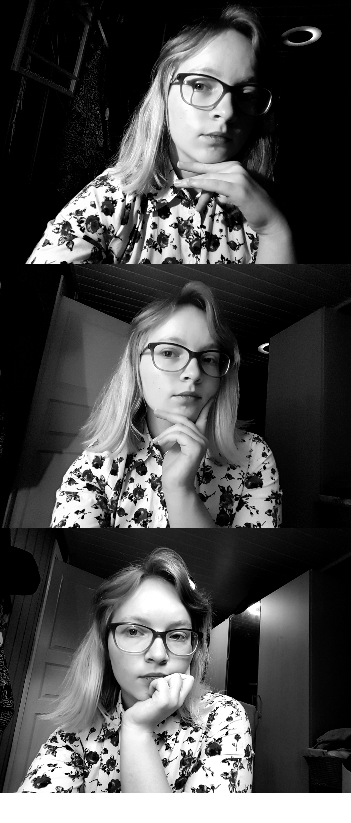
LA 3) Take a few portrait shots and take a extra look at the lighting, show different light settings eg. hard and soft light.
From the top down the lighting goes from hard to soft. At the top I assisted by my trusty reading lamp. In the middle I added the light from the floor lamp with it’s lampshade aka it’s softbox. And bottom picture is daylight, lamp and sealing light. I choose to present it in black and white to bring out contrast.