Second year expectations
Finally back after a very needed Yule-break. Last week we did a kick start assignment about our journey so far and expectations for the new year and starting our second year as Graphic Design students. For this year I’m focusing on creating balance and getting my priorities right, last year I didn’t priorities very well and my work load wasn’t sorted evenly, I ended up having huge piles of work to do right before deadlines and on top of that choosing to take more shifts at my part-time job. This year I’m planning for what’s needed to be planned, and tackling surprises as they come.
Definition
Gestalt is German for «unified whole». It’s about how we and our brains see patterns , understand groupings, how we «connect the dots» if you will, literally. Gestalt has six principles; closure, proximity, continuation, similarity, figure and ground, and symmetry.

Principles in action
Statoil is the Norwegian state’s oil company. The icon shows both a flame and a oil drop, I would put this under the «figure and ground» and symmetry category, at first look I would add the closure principle too since that is the way I have looked at the logo for years, until I was told the figure in the middle was supposed to be a drop.

Norges Husflidslag is where we get our national costumes aka bunad, it’s an organisation that preserved old and new traditions within cultural crafting such as knitting and sewing. The icon is inspired by the Selbu Rose, it’s composed with repetitive shapes in symmetry, i would categories this as similarity, proximity and symmetry.

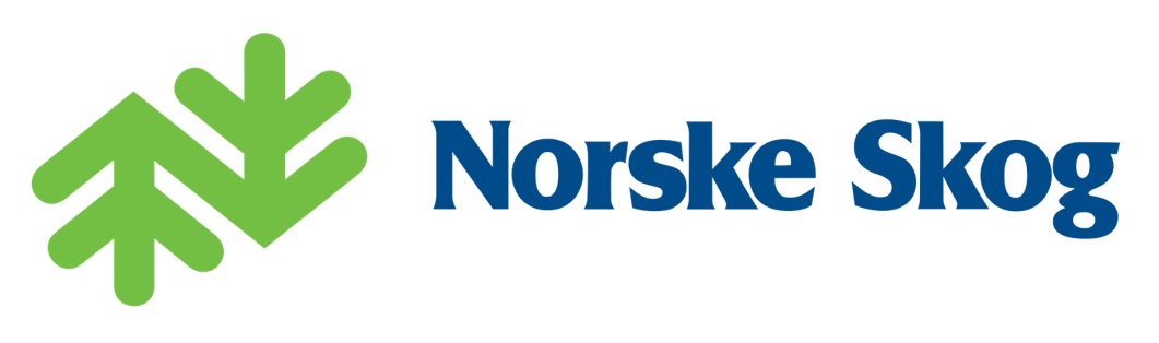
Norske Skog translates literally to Norwegian Woods/forest, they cut wood and make paper. This logo is a mix of continuation and similarity .
Tine is Norway’s biggest dairy provider, the blue icon is and old traditional cheese tin. I’ll start with the blue tin as it stands out with colour and the general shape, therefore I would add the proximity principle to the mix. The red Tine icon is a figure and ground principle. And the principle the ties the logo together would be symmetry as the icons are aligned and centered to each other.

Themes of Thinking

Ergonomics – Ergonomics is the practice of designing in accordance with physical human needs, to optimise performance and minimise discomfort. Ergonomics focuses on safety, efficiency, productivity and health in work settings to ensure that products, services and environments are compatible with the human form.

Focus – Select only the key messages or elements as the focus for the design. A company may have many products or projects, but the design should focus on the most important ones. Information about other aspects of the company can be provided via other communications such as printed materials, brochures or the web page.

White Space – Some believe that white space allows key design elements to breathe and be easily seen. It also helps the viewer to focus attention on them, giving them greater impact. Clients often feel that white space is wasted space, so throughout your design career you will cast war against clutter and educate clients about the value of breathing space.

Graphic Impact – According to many designers, graphics should create a visual impact that grabs the attention and reinforces text communication. However, if there are too many graphics or if graphics become too large or complicated, it may become distracting.
sources
https://en.wikipedia.org/wiki/Gestalt_psychology
https://www.interaction-design.org/literature/topics/gestalt-principles
