Here we’re giving a picture a different life through changing colors AND creating a book cover based on a color contrast.
Here is our starting point:
Andy Warhol / Pop Art
I love this cartoon style !
Sepia
Split Toning
Split tone combo of green and magenta
Freestyle / Vintage
Book Cover
For the cover of «To the Lighthouse» we’re asked to use complementary colors and get across feelings of anguish and uncertainty. I chose the blue and yellow contrast, and chose this sea at night theme. I feel anguish and uncertainty when I think of the night and sea, there’s like something so beautiful about them but there’s this unknown to it too. I hope I got some of that out through this cover.
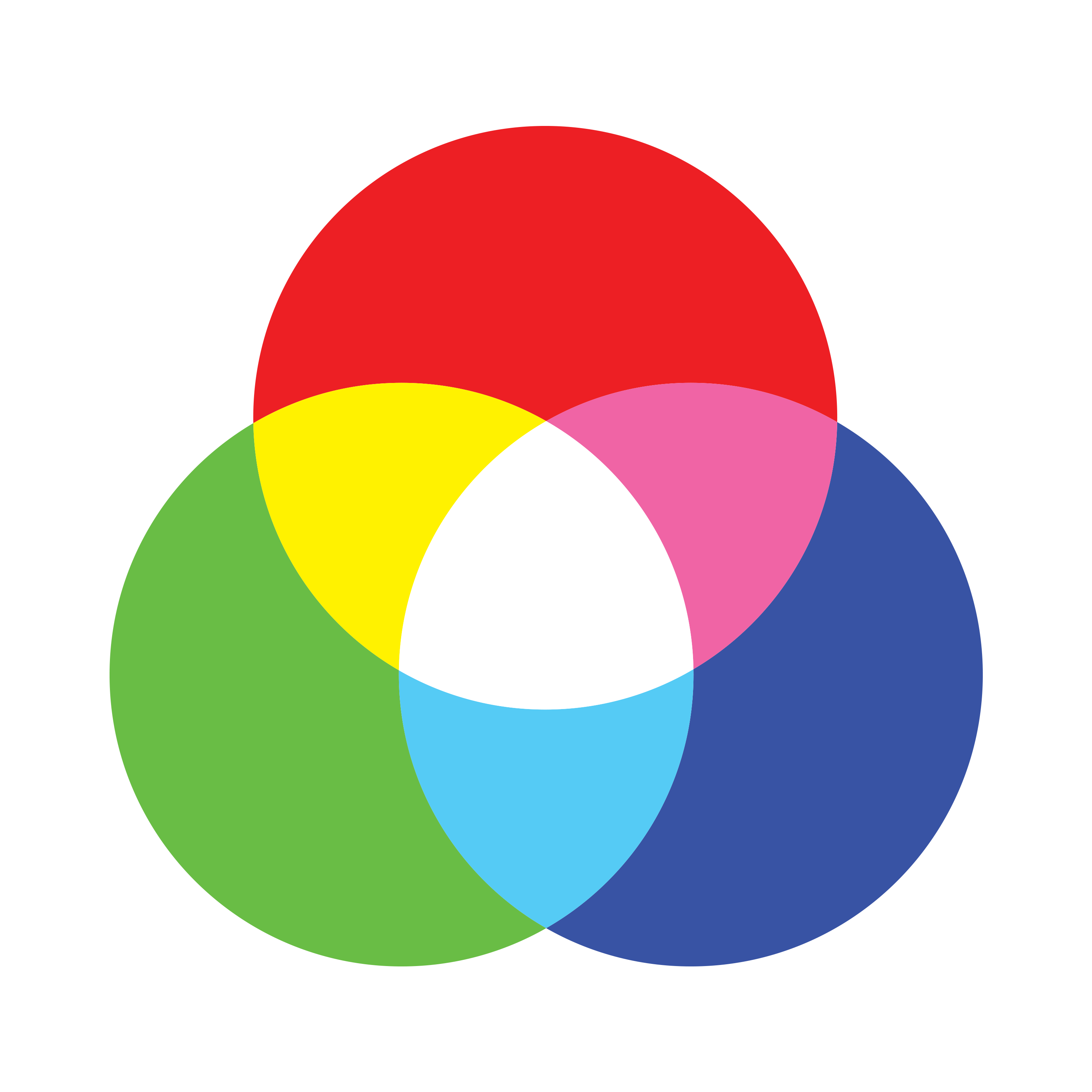
Colors are everywhere. Colors are combined to make other colors therefore we need something to help us recognize in order to recreate/translate that color. Color systems are made to show you a color’s value, value being how much of the different colors has.
RGB
Short for Red, Green and Blue, and is used for digital monitors such as computers, phones, digital cameras and scanners. RGB colors appear brighter than CMYK, because they’re displayed through light, and can be difficult to translate to CMYK.
CMYK
Short for Cyan, Magenta, Yellow and blacK, and is used for printing machines. CMYK uses ink to add color to desired object. The brightness of the colors is affected by the color of the surface that’s printed, in short bright RGB colors can be a challenge and has to be converted to CMYK before being sent to print.
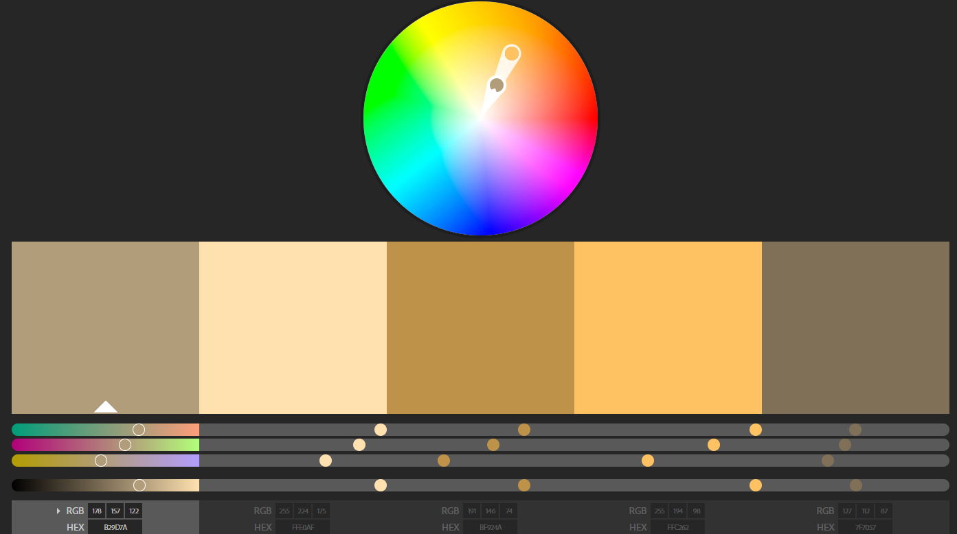
Monochromatic
Monochromatic are colors in the same hue but in different shades, tints and tones. In the color wheel you can see the pipettes are place in line, following the same hue and you can see how tones shifts through the wheel.
Complementary
Complementary are colors that are across each other in the color wheel.
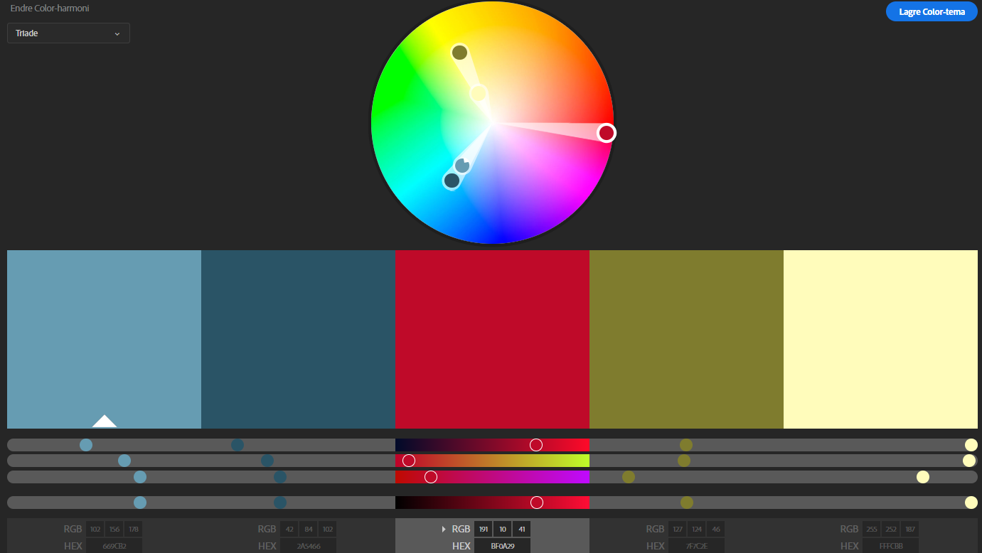
Triadic
As the name suggest, color are picked in a triangle and gives three different hues of color.
Analogous
By pairing colors that sits besides each other they create a analogous contrast and harmonize well together.
Creating color palettes I find to be very therapeutic and satisfying. It’s such a great tool for any project with colors, whenever that’s graphic design, sewing, painting or you setting up an outfit, highly recommend!
For this assignment we’re designing a logo for a client, Food and Malt by Anders and Even, a delicious mix of micro brewery and fairly priced fast quality food. The place to be for the trendy youngsters and hipsters.
I researched Andres’ background a bit to see sort of what kind of aesthetics and brands he’s been working with. Since he’s been working in the same industries it would also be great to see how they used their logos in store and on products.
Brooklyn Brewery , Nøgne Ø Sense that’s handcrafted, traditional, passionate, hygge, friendly/homie, special. Well know, both of them. Strong brand when it comes to design. Round shapes to fit in various places. Simple and easy recognizable logos, even in different colors and edits.
Uncle Billy’s Brewery Plays well with mascot concept. Fun design and overall seems like a great place.
Rita’s Bar and Dining I like the colors and graphics, a bit messy site for my taste.
Competitors: Naboen, Henrik Øl og Vinstove, and Spisekroken
Didn’t find too much info, since their websites either didn’t exist or haven’t been updated since the early 2000’s. Judging by their websites I wouldn’t be too worried, as long as Food & Malt sets up a well designed and functional website. Also I don’t get the sense that any of the competitors has a well executed concept, it all seems outdated and messy. When I visited Naboens website I was nervous to click anywhere, it literally looks like newspaper cut-outs and glued on paper, sketchy! And ,no tea no shade, I don’t really see why they’re competition. The only thing is that they seems to have been there for a looong time and it’s located out on the street, while Food and Malt will be located inside a hall.
Location: Kjøttbasaren
This is the ultimate location! A collective of great restaurant, bars and cafes, Food & Malt would feel right at home. Price and food-wise I think Egon is their real competition, Food & Malt really needs to excel and differentiate them self from Egon. Other than that I think Resturant 1887, Biblioteket Bar and Starbucks will compliment Food & Malt well!.
Visual inspiration
As inspiration I found these logos. They match the criteria Anders and Even set for their logo, hipster, letterpress, quality, homemade and professional.
Sketches
In my sketching process I first drew out some bits without looking up inspiration, I played with letter placement, small doodles and came up with this simplified mountain made up of F,A and M. Later I looked at logos, styles and uses from Anders’ past experience, since Food and Malt is similar to those businesses. Then I looked up some references for how I should build my logo and looked for details that I hadn’t thought off during my first sketching.
Skriv bildetekst…
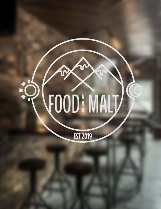
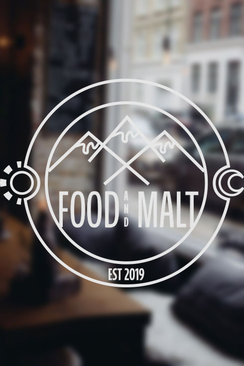
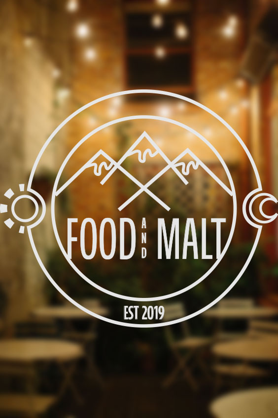
Final design
I really liked the versatility of a round shape and went with that for my final. Since my shapes were simple I thought there were more room for details.
Logo template
Overall I think they can work a bunch of different themes with this logo, and it can be “dressed up and down.
Final design
I kept a nature theme with the sun, moon and mountain, together with the stamp/letterpress style I think it represent traditional, handcrafted and natural. As much as the sun and moon is decorative I thought it also could represent timelessness and that this ain’t no night bar only type of bar.
A few different fonts I tested out and didn’t make the cut.
Working with typography and graphics it’s important to know how to express through type to really take it all to the next level. Here I’ve tried to elevate the words’ meaning by editing the type.
Here are my sketches of a few different words we could choose from.
Repeating Repetition
Subtracting from Subtraction
Express your own made up word
This last one I found to be such a challenge. Through the week I tried to think of my made up words, at home, at work, I was taking the bus and I had my eureka moment. «Busse» literally mean «bussing» – taking the bus. As if someone asked how I’m getting home, I’ll say that I’m «bussing».
Talking about typos, have you ever heard about The Typos? Me neither, but I happen to have designed their next album cover, they’re still figuring out the tittle… What genre comes to mind when you see this? I hope at least something electronic. We could chose between indie rock, electronic or hip hop. I has this idea that this album contains some laid back, chilled electronics beats. I love, love , love these retro fonts, they’re so fluid and I hope the motion in the type and background could express what kind of music the audience could expect.
I based the song tittles of the shapes I created in the stripe background.
In my sketch, wished I had more, I really just planed what kind of fonts I could use for the different genres.
As a note to self for the next weeks and further on I HAVE to plan out my time better. These weeks assignments got rushed and I’m not too happy about that, doing the assignments with better time management I would enjoyed them more. Set it up and prioritize!
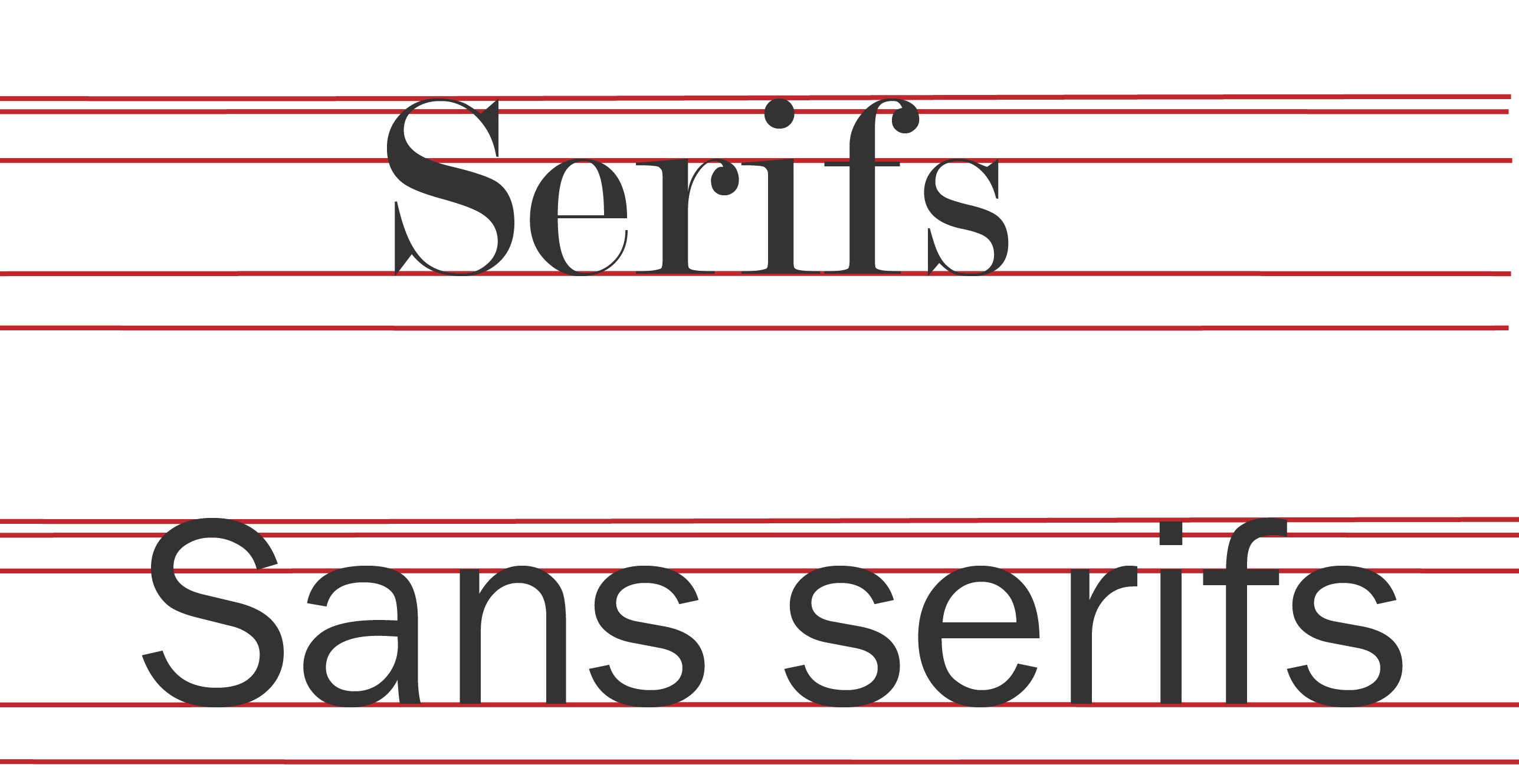
Like everything else, type has «body parts» and a lot of terms for every bit. Our school book had a good few handfuls of terms but when I looked up online, I found a billion more. Here I’m illustrating a few terms I found either useful or fun, enjoy!
Serifs are those little flicks an dots. They originates all the way back to the roman times! Sans serifs literally means «no serifs» .
Did anyone else had to place letters in houses when you first learned how to write? This remembered me a lot of that! Where the stem of the «k» would go all the way up to the loft and «g» would go down to the basement. In grown-ups terms that will be the Ascender line and Descender line.
I did these sketches to get the ideas flowing. I would love to add actual legs and eyes, unfortunately I was running short of time.
For this assignment we’re analyzing the 7-Eleven logo and redesigning it with a few specific Gestalt Principles in mind.
Both of 7-Eleven’s logos are square shapes, one more rectangle than the other. Both uses the same colour palette, green, red, orange and white. The warm tones really makes the «7» pop out from the rest, even when it’s interrupted with «eleven» the shape still stand strong and is recognizable. Also I think the orange add smoothness to the red and green contrast, that can come off as a bit sharp sometimes. As for the white shape within the logo, I think it looks like a cup or beverage and it also flows nicely with the «7» with the slightly broader top. 7-Eleven’s legal name is «7-Eleven» not 7-11 or Seven-Eleven, that’s why it’s formulated as it is, If anyone wondered. Maybe you’ve noticed it before, «eleven» is written in all capital except from the «n». From my 5-min research there isn’t any clear statement why, a theory is that a capital «n» seemed too harsh. I never thought about it till now, the lower case «n» is definitely smoother and a bit more airy, maybe a capital «N» made the whole a bit cramped, who knows.
These are the principles I found within the logo.
Closure = The “7” is broken up to three parts and “eleven” breaks through “7”, still we can clearly see the «7». Figure/ground and Grouping/similarity/proximity = Different colours separates each element from each other and from the background. Colors connects elements of the logo. E.g «7» is reds and «eleven» is green. Red and green are complementary colours and harmonize well while standing out. The orange adds a soft extra dimension. Continuity = The number seven/7 goes through the whole logo. «Eleven» adds a line across the logo.
My chosen principles
I chose figure/ground, symmetry and simplicity. These are my sketches.
I went with my figure/ground idea and this is what I ended up with. It is not much of a change, I tried to morph every element together and threw out all the whites (basically editing out the closure principle). One thing I definitely learned is how important the white is, working close up with these colors together made my eyes hurt a bit.
This week is all about «behind the scene» of a brand. Touching on market position and ideals. For this one I went to IKEA to see how their ideals are practiced in their stores, it was really interesting. Learning about ideals and brand values in lessons gave great inspiration and insight for brands in general but also my future brand. Setting ideals and values seems to make every decision so easy, it’s so so useful to have guidelines to guide a brands direction.
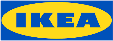
IKEA – Logo
When I see IKEA, I immediately think of Sweden, cozy, everything for everyone, welcoming and meatballs. The yellow and blue shows strong connection with Sweden’s flag. IKEA stands for – Ingvar Kamprad Elmtaryd Agunnaryd. Ingvar Kamprad is founder of IKEA, Elmtaryd is the farm where he grew up and Agunnaryd his hometown. I think it’s a simple but bold and I think it’s a great versatile logo.
Ideals – practice what you preach.
IKEA’s vision is to create a better everyday life for the many people. They afford a wide range of interior styles and different products that could fit everyone’s taste. The store it self is made so you as a customer could either go shopping all by yourself without talking to anyone or if you need someone to discuss what table would be most practical for your home, bring it to your home and set it up for you – you can get that too.
At my local IKEA store this welcomes you by the entrance. You can do it all by yourself. But you don’t have to.
«To create a better everyday life for the many people.»
Does this apply to their range of products? Yes, I absolutely think it does. I’ll say that their products are often simple, easy to customize or has personality in forms of prints or details. There is something for everyone.
Here are some examples from their inspiration blog at ikea.com. Showing three completely different styles.
IKEA HACK
Back in my first year of upper secondary school when I studied arts and crafts, we went to IKEA to find products, give them other uses and modify them, also called IKEA HACK. I’m not sure where this originated but it is such a great way to encourage customers to be creative and see possibilities in products you kinda like but isn’t exactly what you want.
I think IKEA stores are nice and airy. Though there is a million items, the displays are clean and sorted. For this store the top floor is were the showrooms are, actual fully decorated rooms, marketed for different needs and styles. A great way to show products in action. It’s logically mapped out by furniture, first sofas, then tables, so chairs and so on. In the kitchen and shelf apartments employees can help you with set up and you can even pay and be done without going through the whole store.
half way there is the IKEA Restaurant where customers can have a nice meal, have a rest and get their blood sugars up before they continue. This particular store is about 3,5 km long if you follow the arrows!
It’s never too late to shop, all round the store their yellow shopping bags are always in sight.
Down stairs is the «marked hall» I think of it as where you grab your cart and shopping. Items are sorted by «kitchen», «textiles», «bathroom» and so forth. Before the cashiers is the big hall where you pick out your flat packed table or chair.
From my personal experience I am a big fan of the all by your self approach, I love having plenty of time and just go around looking for treasures. And as a someone with no car I really appreciate that I can get it sent home. There are so many services available, this may differ in other stores, but there is a service for every need.
Visual display
As mentioned i think it’s clean and nicely organised. I love how showrooms makes things come more alive and gives great inspiration. Items are clearly tagged and the tag contains all the useful information you’ll need, materials, price, shelf number and even how they can be used.
This week is a lot about «behind the scene» of a brand. Touching on market position and ideals. What are these brand’s position? Look at the following logos and explain in your own words what you consider their positioning to be.
I sat like a confused dog with my head tilted when saw this assignment, didn’t really understand what positioning I was supposed to describe. I hadn’t got my books by then, so I did had to research positioning first of all. The position we’re describing is market positioning, then it all made sense to me and it made me realize how much a logo carries.
Position – per definition “a place where someone or something is located or has been put/placed”. In this sense we’re thinking of market positioning, who’s the brand’s audience.
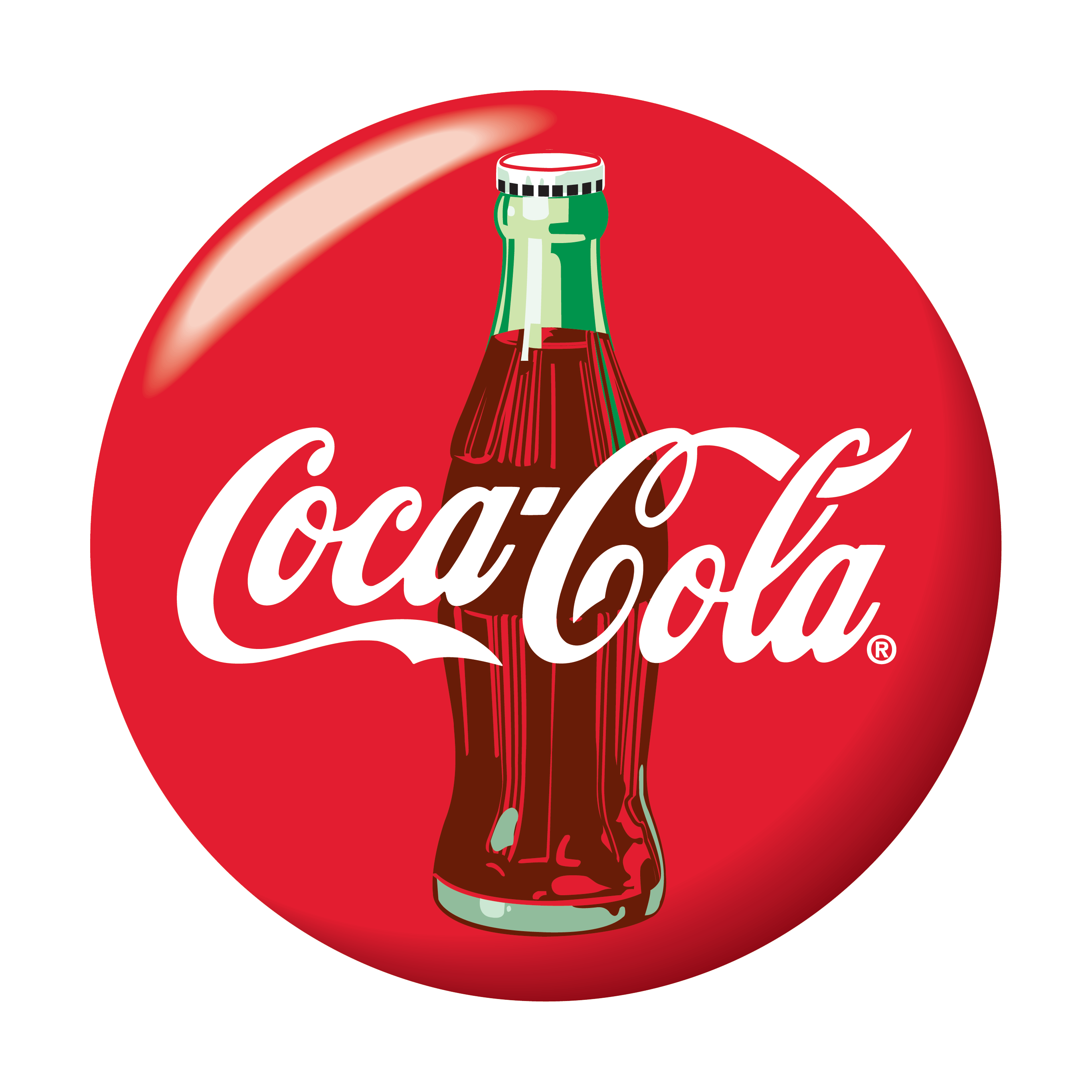
Coca-Cola
When I look at Coca-Cola’s logo I immediately get associations with Christmas, family time, weekends, football world cup, memories and gatherings. When marketing, Coca-Cola really takes charge of every occasion there is, doesn’t matter if is the world cup or just by your dinner table. Over time they manage to make their product a everyday staple. I remember as a child, I was shocked when commercials showed Coke at the dinner table everyday, while we were only allowed Coke on weekends. Me and my teeth are forever grateful to my mom for that. The Coca-cola logo is such a timeless and easy recognizable logo. It has class that feels like quality, it’s simple and it carries so much warmth within the red color. You just feel great because of the lovely associations. I looked through their slogans over the years and I picked three that I think really speaks what Coca-Cola was accomplished, “Thirst Knows No Season”, “Where There’s Coke There’s Hospitality” and “Things Go Better with Coke”. Looking at this from a marketing point of view, Coca-Cola has conquered everyday life and everybody.
Volkswagen
Volkswagen is German and literally translates to “People’s car”. I don’t have cars as a subject in my daily life as we speak and I’m not that updated with the market. When I hear Volkswagen I think of the classic beetle, hippie vans and all together I get a robust car with a classic design for the everyday man. From the beginning Volkswagen has been advertised as a affordable and sustainable for everyone.
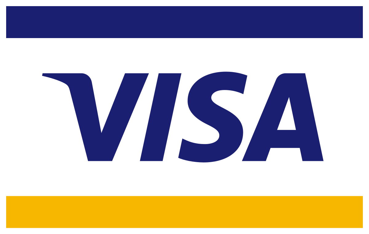
Visa
Like the previous brands, Visa’s position is very central. It everywhere and so widespread, as the tagline says «Everywhere You Want To Be» so shall it be. Visa is in simple words, a access to your bank through the Visa network with a Visa card.
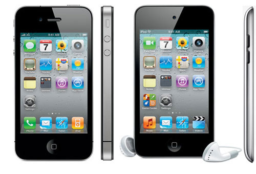
Apple
I see Apple as different, unique, professional. The brand goes beyond just phone, it is software, iCloud, iTunes, App Store and so on, everything is connected and flows easily between devices. They really established a strong brand through consistency in looks and products. When looking for a phone or computer, I always think “choosing Apple is so easy”, there are few models, they stand out and everything about it seems so easy. They comes of as a customer friendly, easy to use, stylish, all-in-one device.
As for now I think iPhone/Apple is at the same level as many other brands, it’s still solid as a brand. But I think phones in general now has other standards then 10 years back. Almost all of them look the same but the software and specialties are the deal breakers. Now, I’ve only owned a iPod in my life and never upgraded further, so I may be biased. Sorry ’bout it.
iPhone 4 and iPod Touch 4th gen
I think Apple has a strong following, once a customer always a customer, this can defiantly be for other brands, but only Apple has its kind software. If you own one Apple device they can easily connect with other Apple products, this courage customers to buy all Apple products. From my personal perspective; before iPhone, mp3 players and iPods was very popular among kids and teens, the brand was setting roots. When iPhone released a touchscreen phone, which was rare and no other company had have breakthrough with that, it was revolutionary, new, innovative and it looked real good too. I especially remembered when iPhone 4 was launched, ‘cause everyone was having it.
As for how they researched for iPhone, I think they saw how more and more touchscreen devices were coming up, like handheld gaming consoles and other attempts of touch phones. I think they just polished their design really good and came up with a easy-to-use, polished phone.
I think the logo fits great with the brand identity, it’s simple and it’s a solid statement. The logo is positioned at the upper back of the phone and I recall it working wonderfully as a mirror and handy when taking pictures. And we stan a multi-purpose logo!
Have you ever bought something just because the label looked cool? I have! Unfortunately I don’t have a big collection for show, but I do have two Arizona Tea glass bottles and a few random soda bottles, somewhere.
This week’s goals
– Draw at least 15 sketches of labels for «Loose Juice – orange and banana flavour».
– Take one of them and make a final design, using Adobe Illustrator.
I have never successfully used Illustrator. Back in 8th-10th grade I became OK at Photoshop, since then I haven’t really used it.
Forward to now, my first attempt was around 11 pm after a day at work. Nothing moved as I wanted it to and I almost lost my mind over the pen and selection tools. Luckily a good night’s sleep fixes about any thing. Right now I’m having such a blast drawing and editing!
Getting into Illustrator
At Noroff we’re very fortunate to have access to Lynda, a learning platform with tons of educational video lessons. A lesson can easily be a few hours long, so I search for some quicker options as a kind of warm up, I personally find this more efficient for myself. I found this 30 minute video and went along with that, tho I almost lost my mind, I found my problem areas and later when I watched the detailed lessons at Lynda I tuned in where I needed help.
Within this video, this pen tool game was mentioned. I also did a few of the tutorials provided by Adobe, and a bit of quick google searches when I couldn’t find some of the tools.
My sketches
When I think of fruit, I think of lots of colours! Then I wanted something eye catching and funky. I like when I can clearly see what the product is about, therefor I made sure the flavour was well represented. Font-wise I wanted something fluid, «Loose Juice» to me needs movement. I tried arranging the fruits in different ways, making them rain, bunch up and placing them like a mandala. I tried using the fruit leafs as representatives, like the idea but didn’t find it clear enough. I ended up really liking the sun ray patterned background and font with a drop shadow.
Final Product and after thoughts
I changed the base colour from block yellow to a gradient from yellow to green.
Oh boy did I have much fun making this! I am so happy with my first complete digital illustration! I wonder what reaction I’ll have when I look back. I made the orange and banana shapes with the pen and eclipse tool, from scratch with real fruit as templates. I could do this all day and night, I can’t wait for next week’s project!


